




















We make complex innovation easier to understand.
Brand Identity
No one meets your organisation all at once. An investor sees a deck before the meeting. A partner opens the website before the call. A future hire sees a job post, then a profile, then the office. A brand identity is what makes all of those moments recognisably one organisation.
For twenty years — and more than three hundred identities and websites — we’ve designed for organisations working on tomorrow’s world: biotech, life sciences, medtech, sustainable tech, and the innovations beyond. Identities built to make complex innovation easier to understand, and to hold up wherever they’re seen.
We design from Amsterdam, for clients from Ghent to London, Los Angeles and Cape Town.
4.9 average on Google, 44+ reviews
What a strong brand identity does
More than a logo, more than a style. What an identity earns its place doing — and where, in practice, we most often see it go wrong.
What we often discover: the story exists, but nowhere on paper. The founder tells it perfectly in conversation — yet the moment it has to be designed, no shared version exists, and every design decision becomes a guess.
A brand identity starts with a decision: what does this organisation stand for, and for whom? The design work makes that decision visible — in a mark, in typography, in colour, in how images are framed. That’s why our identity work starts with positioning, not with sketches.
People recognise an organisation before they read a word. The typography, the colour, the way a page is composed — those signals land in the first second, on every channel where you show up.
A strong identity makes those signals consistent. The website, the deck a partner receives, the poster at a conference — each one is recognisably yours, before anyone reads the name.
Around an innovation organisation, everyone reads the same identity differently. The engineer looks for substance, the marketing manager for the story, the board for credibility.
A good identity gives each of them something to hold on to, without falling apart. Hierarchy, structure and imagery do that work — not as styling, but as a reading guide.
An identity has to work in places you haven’t designed yet. New products, new campaigns, new markets — and formats that don’t exist today.
That’s why we design identities as systems: rules and building blocks rather than fixed artwork. Your team can take it further without asking permission for every new page.
4.9 average on Google, 44+ reviews
What we design, specifically
Brand strategy and positioning
Before anything is designed, we make sure it’s clear what you want to say — and to whom. What is the organisation doing, for whom, and why does it matter? What isn’t right yet in the current communication?
Only when the direction is clear do we start with form. The most expensive identity mistakes happen when form comes before direction.
Visual identity design
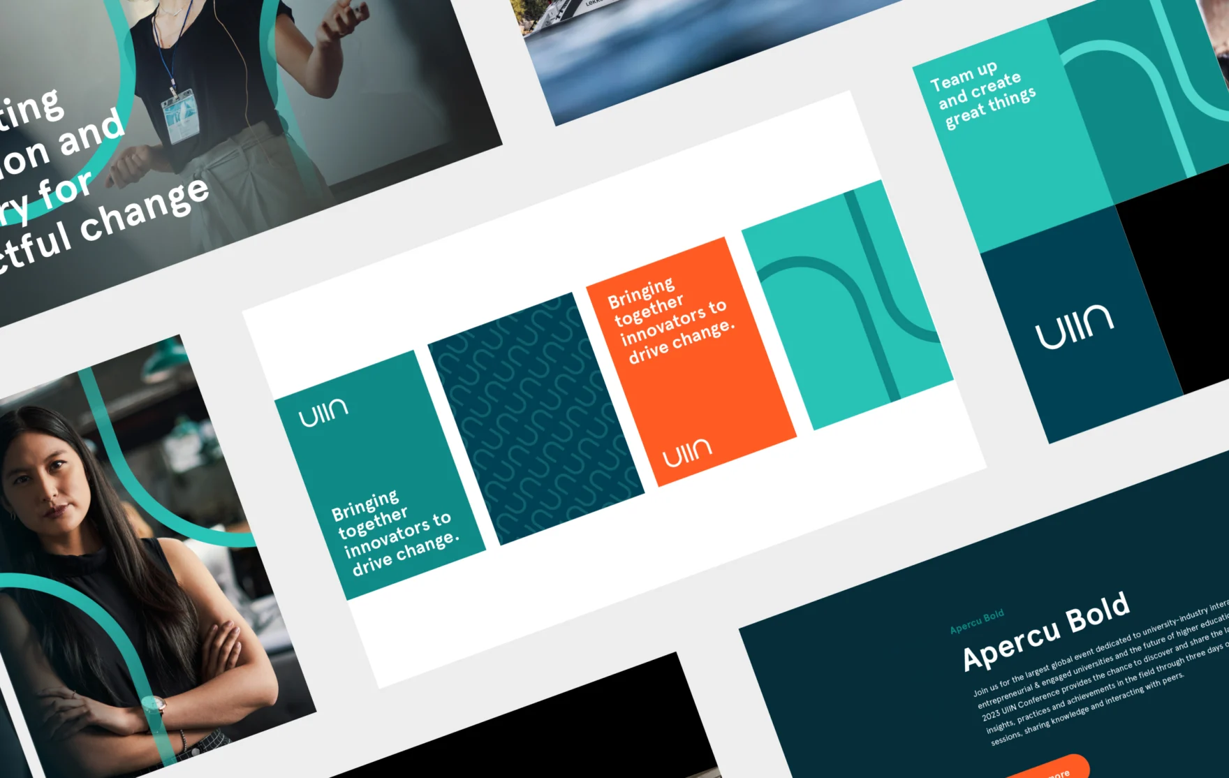
Logo, typography, colour, imagery and motion — designed as one coherent language rather than separate deliverables. Every element is chosen to say one thing clearly, in a way the reader doesn’t have to decode.
Beautiful isn’t the goal; it’s the result. An identity that works for the engineer, the marketing manager and the board is beautiful because it works.
Brand guidelines and design systems
An identity only earns its keep when your team can use it. We document it in brand guidelines that cover the real, everyday cases — the deck, the social post, the conference slide — with the communication framework included, so the direction behind the design never gets lost.
For digital work we take it one step further: a design system that carries the identity into the website, the templates and the product.
Identity, applied
We don’t hand over a PDF and wish you luck. The same team that designs the identity applies it — to the website, to the templates, to the campaign that follows.
That’s where an identity proves itself. And by keeping design and application in one team, nothing gets lost in handover.
“A logo is a signature.
A brand identity is the handwriting.”
— Marsmedia
What working with us looks like
Two to three hours, your core team and ours at one table — founder included, UX and brand included. Everything said there gets clustered into the communication framework: values, goals, convictions.
That foundation never gets lost again — it lives, literally, in the brand guidelines.
We’ve seen too many eighty-page brand strategies nobody reads. Our deliverable is deliberately compact: the essence on one page, the depth behind it, and a presentation that makes it land internally.
A strategy only works when everyone can retell it.
Not every brand needs a restart. Sometimes a refresh is more honest than a rebrand — because throwing away fifteen years of built-up recognition has a price nobody names upfront.
We’ve advised clients against a full rebrand and given them a stronger refresh instead. We’d rather have that conversation before the project than after.
The brand comes to life on the website, in the templates, down to event materials — applied by the team that designed it.
What clients tell us afterwards: “we finally understand who we are ourselves” — and that sales and marketing can work with it from day one.
“In web design Amsterdam, I enjoy strategically shaping elements to draw visitors’ attention and instill trust in their brand’s professionalism. It’s fulfilling to help clients effectively communicate their products or services through visually appealing and user-friendly designs.”
Marsmedia
Curious what our kickoff would surface about your brand?
How we work
Three steps. Everyone knows what is needed, and when.
The kickoff
Two to three hours with both core teams at one table — founder included, your specialists where needed. Everything said gets organised through the Mars Methodology (Project Foundation → Deep Dive → Communication Framework) into the communication foundation, in two to three weeks.
That sets the direction. And then the real work begins.
From foundation to concepts
We translate the foundation into a small number of directions and choose together. Every design decision after that traces back to something you said — which makes it defensible, internally too, in front of a board or investor.
We apply until it lives
Website, templates, presentations, event materials — by the same team, no handover. And in the first months we watch how the identity performs in real use: a brand is never finished on delivery day.
Connected services we offer
Brand
Website
Frequently asked questions
A brand identity is the visible part of a brand: the logo, typography, colour, imagery and tone that make an organisation recognisable. Underneath sits a set of decisions — what you stand for, for whom, and why it matters.
The identity makes those decisions visible and repeatable. Done well, it means every touchpoint — website, deck, campaign — tells the same story, without anyone having to police it.
A visual identity is the visible layer: logo, typography, colour, imagery. A brand identity is broader — it also covers voice, tone and the behaviour behind the visuals. In practice the two terms overlap, and most organisations use them interchangeably.
We design both in one movement: the visual system and the verbal one, so they reinforce each other. An identity that looks right but reads wrong doesn’t hold — and the other way around.
The core is the visual system: logo and mark, typography, colour, imagery direction, and the brand guidelines that hold it all together — communication framework included, so the thinking behind the design travels with it. Depending on scope, we add naming, tone of voice, presentation templates, and a design system for digital.
We agree the scope per phase at the start, so you see what each part of the work delivers before it begins — and what can wait for a later phase.
A logo is one element — the signature. The brand identity is the system around it: the typography, the colour, the imagery, the rules that make everything you publish recognisably yours.
A logo on its own changes little. The system around it decides whether the organisation is recognisable at a glance, on every channel, for years. That’s where the real work sits.
Corporate identity is the older term, and in practice it usually points at the visual layer: the logo, the stationery, the house style an organisation applies across its materials. Brand identity is the broader, current term — it includes that visual layer, plus the voice, tone and behaviour that carry it.
The distinction matters less than the consistency. Whichever term your organisation uses, the question is the same: does everything you publish feel recognisably like one organisation? That’s what we design for.
The foundation stands in two to three weeks — through the Mars Methodology, our fixed first phase. A brand identity typically takes six to ten weeks from there; a project that includes the website runs ten to sixteen.
We plan the timeline in phases at the start. The biggest delays are rarely in the design itself, but in internal decision-making — so we plan for that from day one.
That depends on the scope: an identity with guidelines asks for different work than an identity plus website plus campaign. Early in the conversation we share an estimate per phase, so you see what each part of the work costs before it begins.
For most organisations an identity is an investment they make every five years or more. We’d rather help you spend that money where it actually makes a difference than push for the most expensive version of the work.
Both. Often an identity isn’t wrong — it’s unfinished. A digital layer is missing, the guidelines don’t cover everyday practice, or the system has expanded over the years until no one can explain it.
In those cases we strengthen what’s there instead of starting over. And when the identity no longer fits who you’ve become, we say so honestly — a refresh on the wrong foundation is money spent twice.
The same way: one story, recognisable on every format. Most of our work lives on screens — websites, campaigns, presentations, social — and where print plays a role, we design it in the same visual language.
That’s why we design identities as systems rather than fixed artwork. A system adapts to a format it hasn’t met yet; a fixed design breaks.
Yes. The same team that designs the identity applies it: to the website, to the templates your team uses every day, to the campaign that follows.
That’s deliberate. Most identities don’t fail in the design phase — they fail in application, when the work is handed to a team that wasn’t part of the thinking. By keeping design and application in one team, nothing gets lost in handover.
Three things make our work as a branding agency different.
One: a deliberately compact team of seniors who’ve been in this for fifteen to twenty years. For you that means: fewer questions upfront, faster to the core, and no junior learning their trade on your project.
Two: we start with what you want to say, not with how it should look. Most of the identities we rebuild were designed before the direction was clear — we start from the other side.
Three: we make complex innovation easier to understand for the entire group of readers around an organisation. The engineer, the marketing manager, the CEO, the CFO — each reads the same identity differently. We make sure it works for all of them.
That focus means choosing, too: high-volume B2C isn’t our work. And the proof it holds: ninety per cent of our clients stay after the first project. Volume isn’t our position. Depth is.
Read more
Recent stories on web design, branding and innovation.