Stil | A medical product needs a brand people can trust
Stil had moved beyond the start-up phase. Its brand still looked like it belonged there.
Client
Stil
Industry
Life Science
Medical devices
Services
Brand strategy
Visual identity
Illustrations
Offline marketing materials
Event materials
Website strategy
Wireframes and sitemap
Web design
WordPress development
Context
Stil develops medical orthoses for people living with movement disorders. Its mechanical technology reduces tremor without electronics or stimulation, helping people regain control over everyday movements. After years of product development, Stil was preparing for a more commercial phase, with the ambition to become active across six or seven international markets.
That changed what the brand needed to do. Stil was no longer only explaining a new technology. It needed patients to trust it, healthcare professionals to take it seriously and distributors to represent it internationally. Upcoming medical events made that transition more immediate.
The strategic tension
The product had matured faster than the brand around it. Stil was still perceived as a small, technical start-up. Patients could even question whether the product was already available, while healthcare professionals saw an interesting device rather than an established medical company.
That gap matters when moving from development towards adoption. Stil had strong product results and international ambitions, but the company around the technology did not yet communicate the same maturity. To grow, the perception of Stil needed to catch up with the quality of its product.


The real challenge
The old website was not fundamentally unclear. The product was visible and the technology could be understood. What was missing was cohesion. The brand, website and wider communication did not yet feel like one recognizable company, while patients and healthcare professionals were being served through largely the same experience.
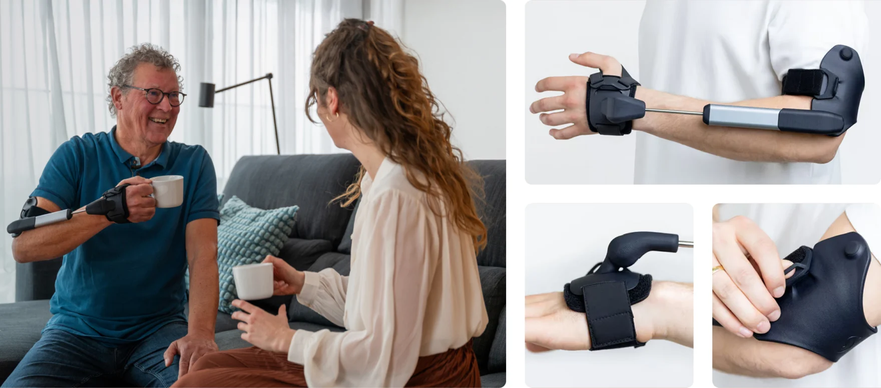
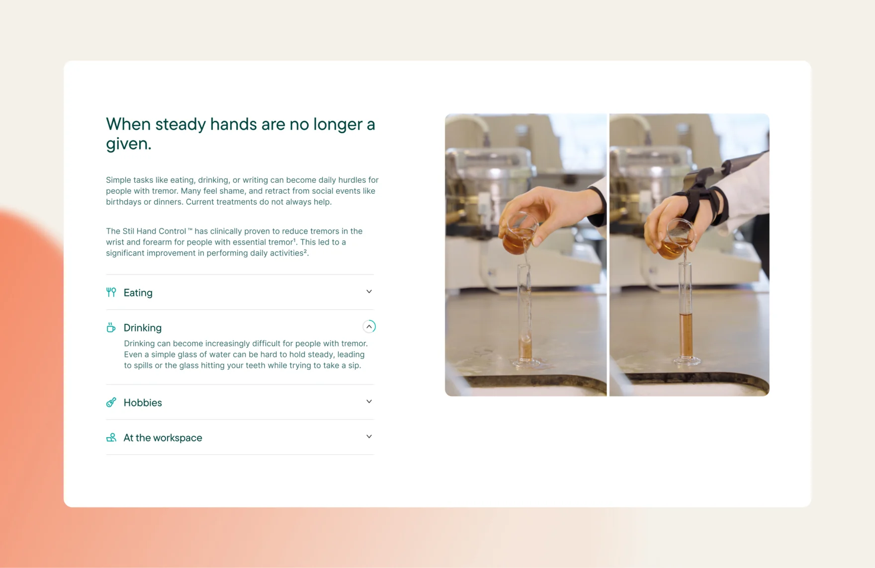
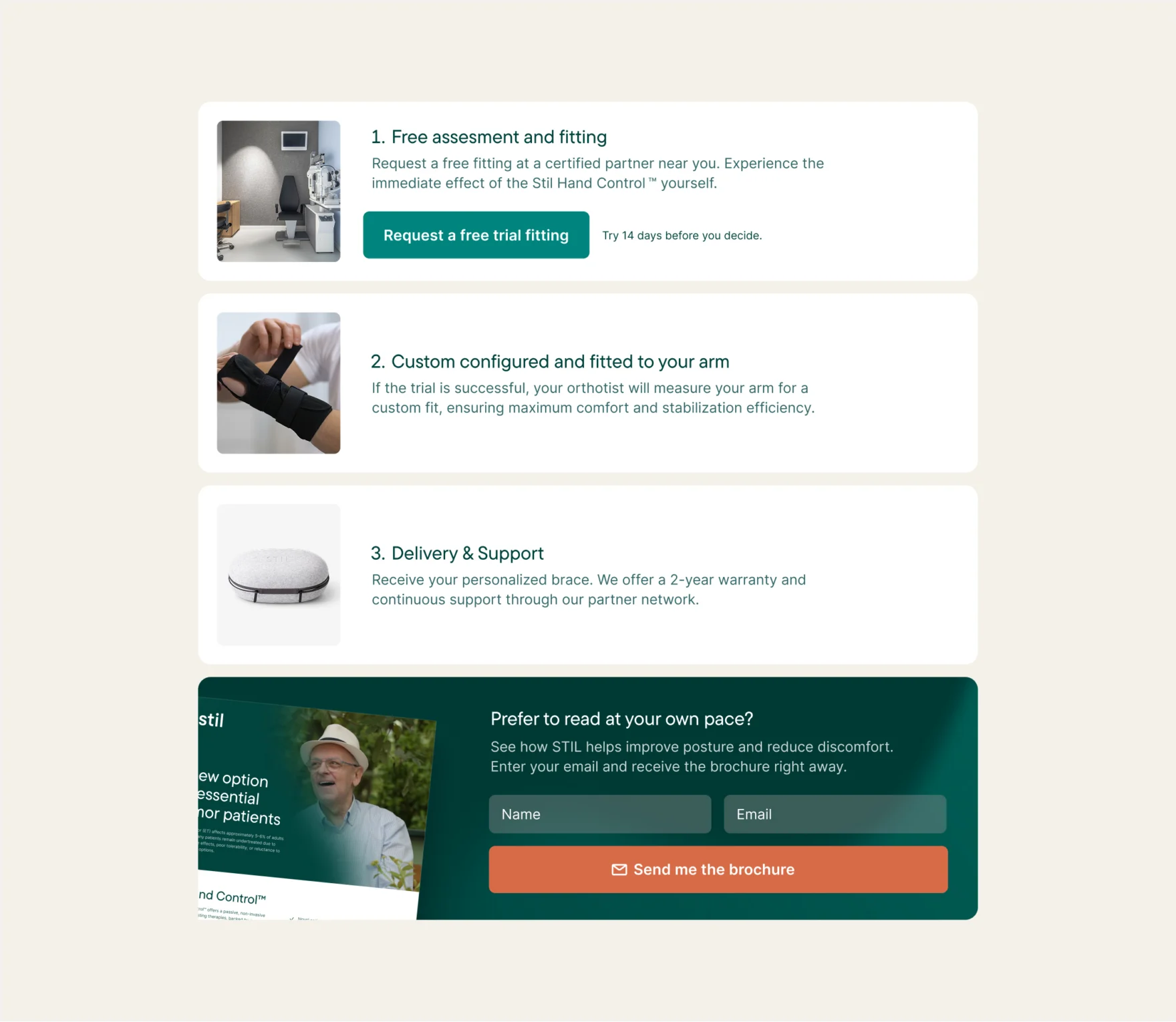
The product itself was also easier to understand in person than online. Once you handle the Stil Hand Control, its simplicity, lightness and ease of use become obvious. The website did not communicate those qualities strongly enough. At the same time, important actions such as requesting a fitting needed a much clearer place in the journey.
Our approach
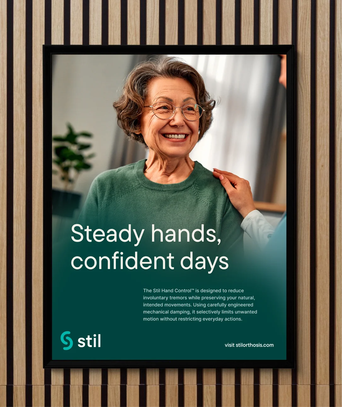
We started by defining what Stil needed to represent before deciding what it should look like. Together, we explored the values behind the company and translated them into a clearer direction built around human-centered communication, medical trust, calm innovation and reassurance. The story shifted accordingly, from explaining the mechanism first to showing what the technology gives people back: control over everyday movement.
That direction became the basis for the identity, website and wider communication. Mars also worked with Stil on the naming of its products and product series, creating a structure that could support international growth. Photography, video, illustrations, diagrams, brochures, cheat sheets and event materials were then developed from the same principles, turning separate touchpoints into one recognizable system.
Strategic choices
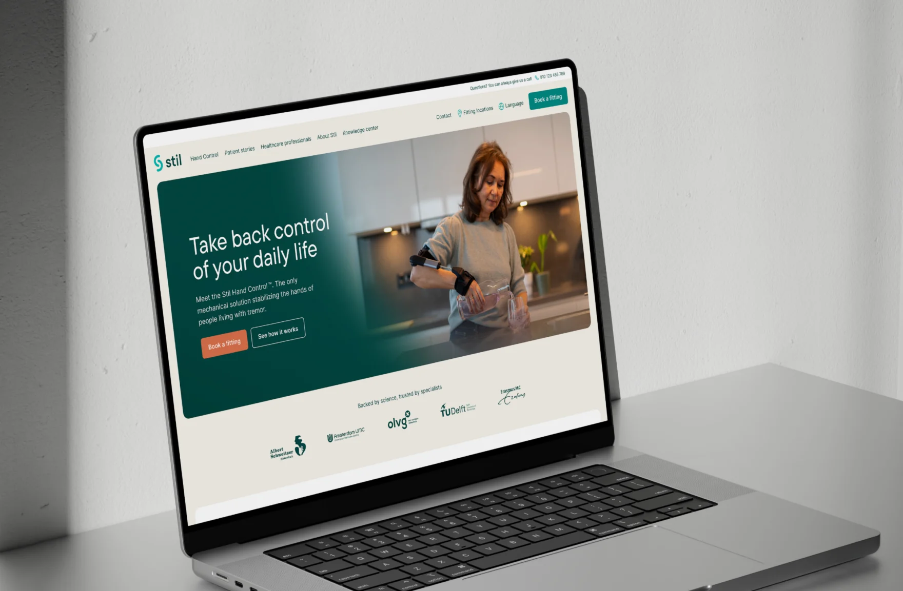
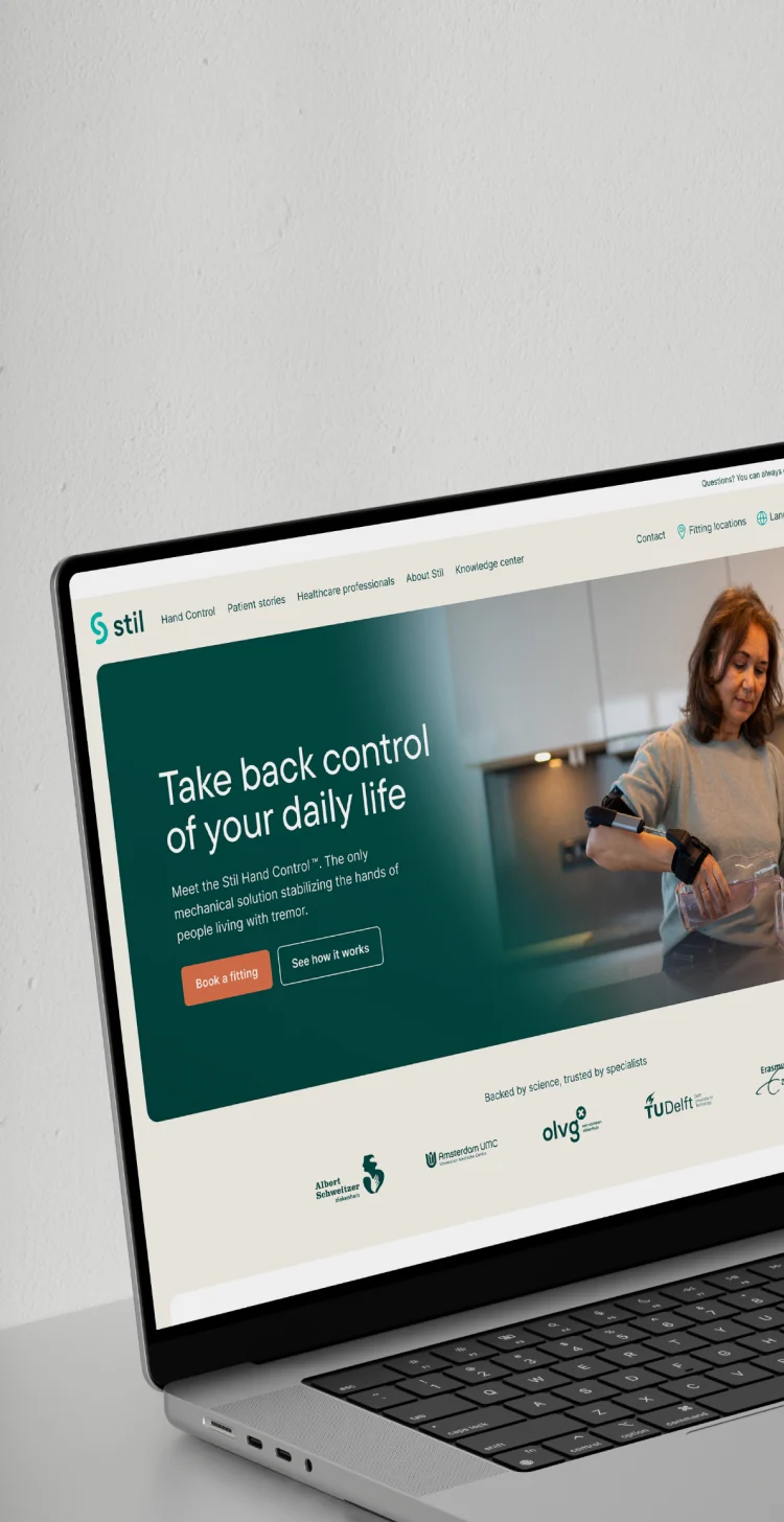
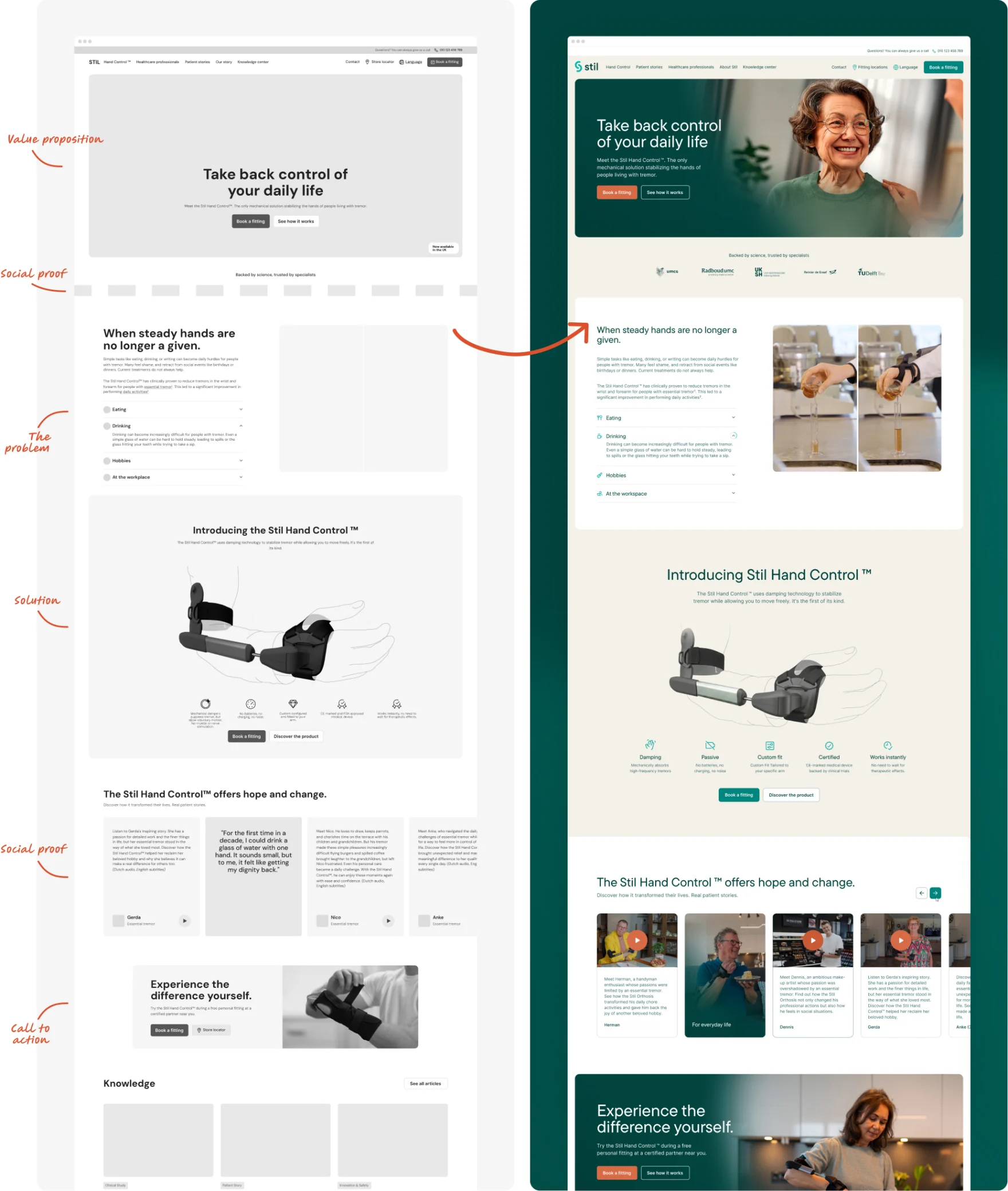
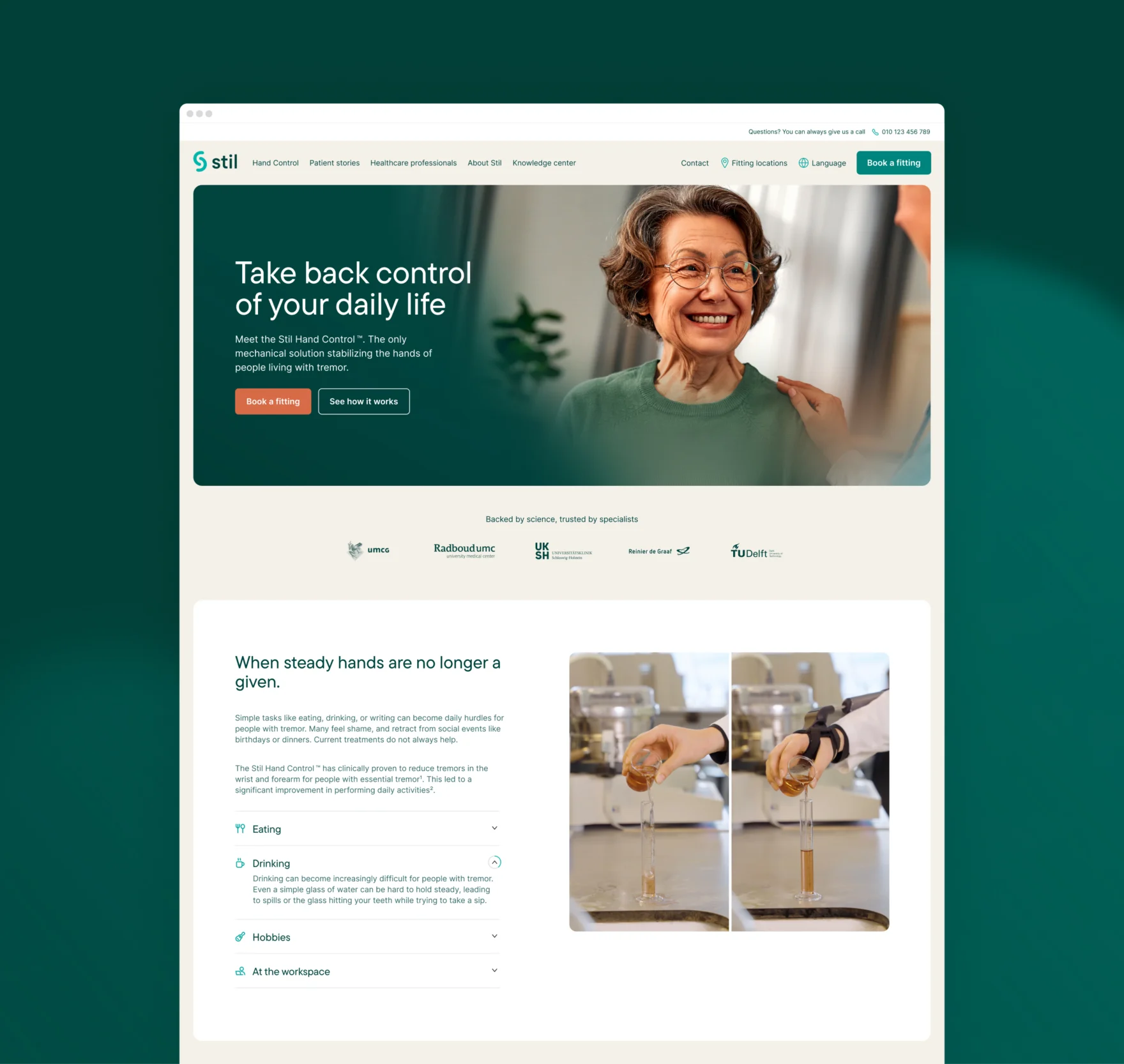
Patients and healthcare professionals needed different routes without creating two separate brands. Professional communication became cleaner and more clinical, with greater emphasis on evidence and product information. Patient communication introduced more warmth and focused on independence and everyday life. Navigation was simplified, content reduced and readability prioritized for a patient audience averaging around 67 years old, with around 80% of website visits coming from mobile devices.
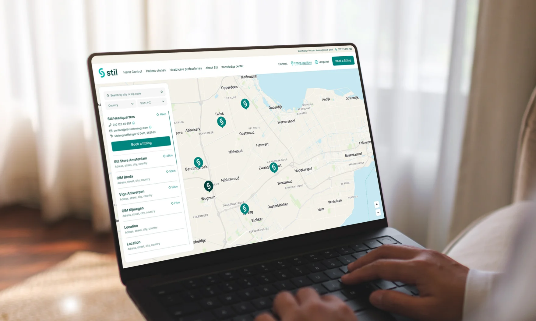
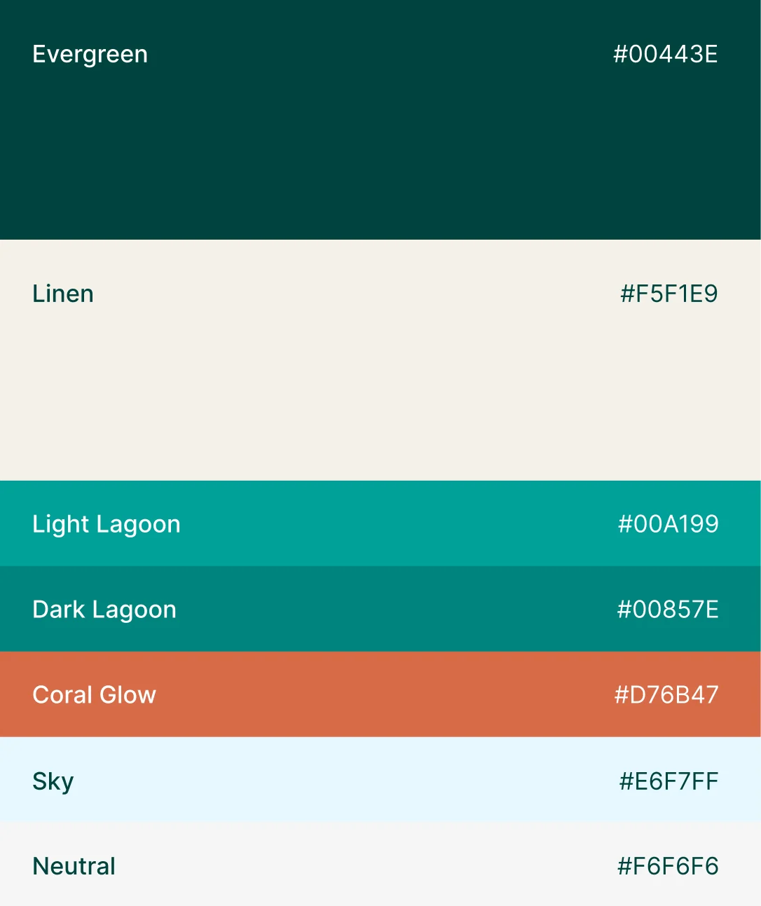
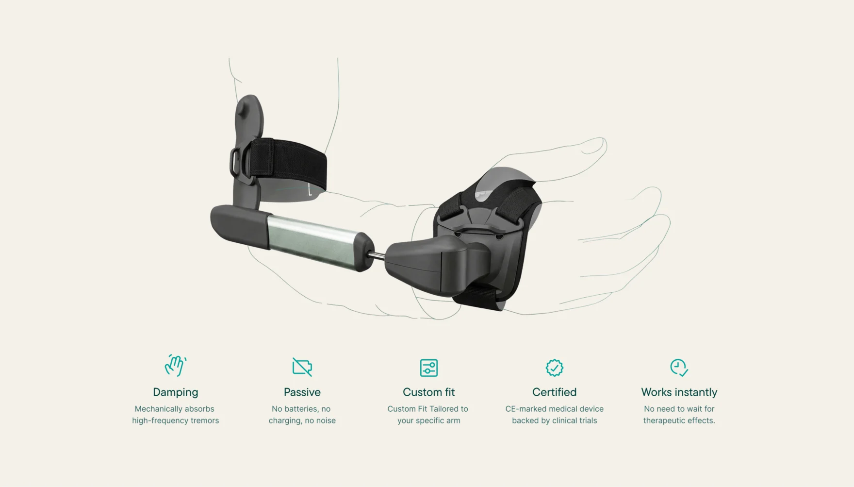
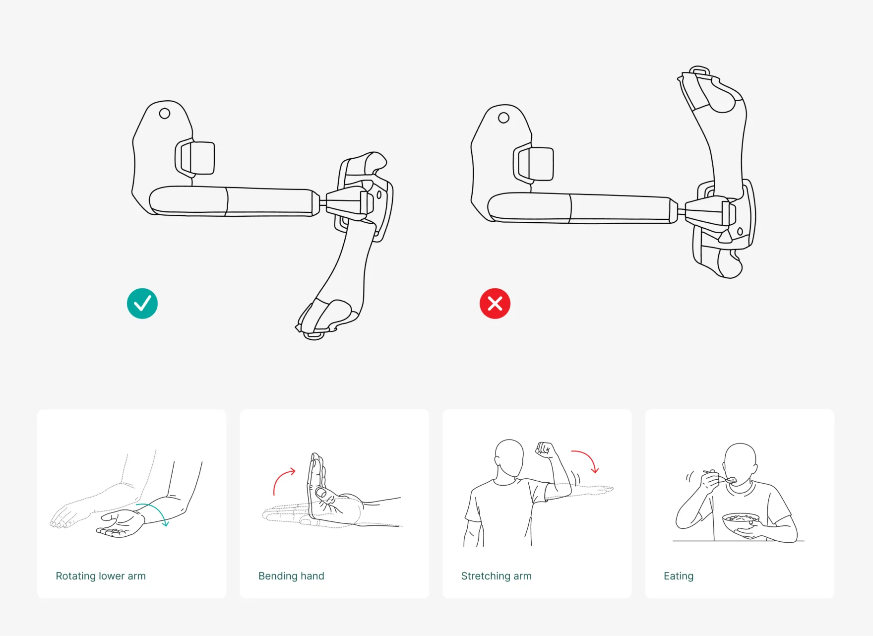
We also made the product easier to experience online through new photography, video, illustrations and explanatory diagrams. Requesting a fitting became a more prominent action, supported by an international fitting locator connected to Stil’s internal systems. At the same time, we deliberately kept elements that already worked, including the logo and established colors. The objective was not to reinvent Stil, but to make the existing company clearer, more consistent and more credible.
The result
The clearest early response came at medical events. Stil used the new identity and materials at several congresses, where the team received positive reactions from healthcare professionals, distributors and people who had encountered the company before. Internally, communication now follows one recognizable direction and the team feels the brand better represents who Stil has become.
It is still too early to make reliable claims about website performance. No post-launch conversion figures are available yet. What can already be observed is the change in presentation: Stil now enters the market as a recognizable medical brand rather than a technical start-up with a promising device.


Reflection
Medical technology companies can spend years proving that their product works. During that phase, branding understandably comes second. The tension appears when development turns into adoption and the company suddenly needs patients, physicians and international partners to trust not only the technology, but the organisation behind it.
At that point, evidence alone is not enough. The way a company structures, explains and presents that evidence becomes part of its credibility. Stil did not need a more impressive story. It needed the strength that was already there to become easier to see.