Owlin | A strong product deserves a website at the same level
Client
Owlin
Industry
Risk Intelligence
Tech Innovation
SaaS
Services
Visual identity
Illustrations and infographics
Website strategy
Wireframes and sitemap
Web design
WordPress development
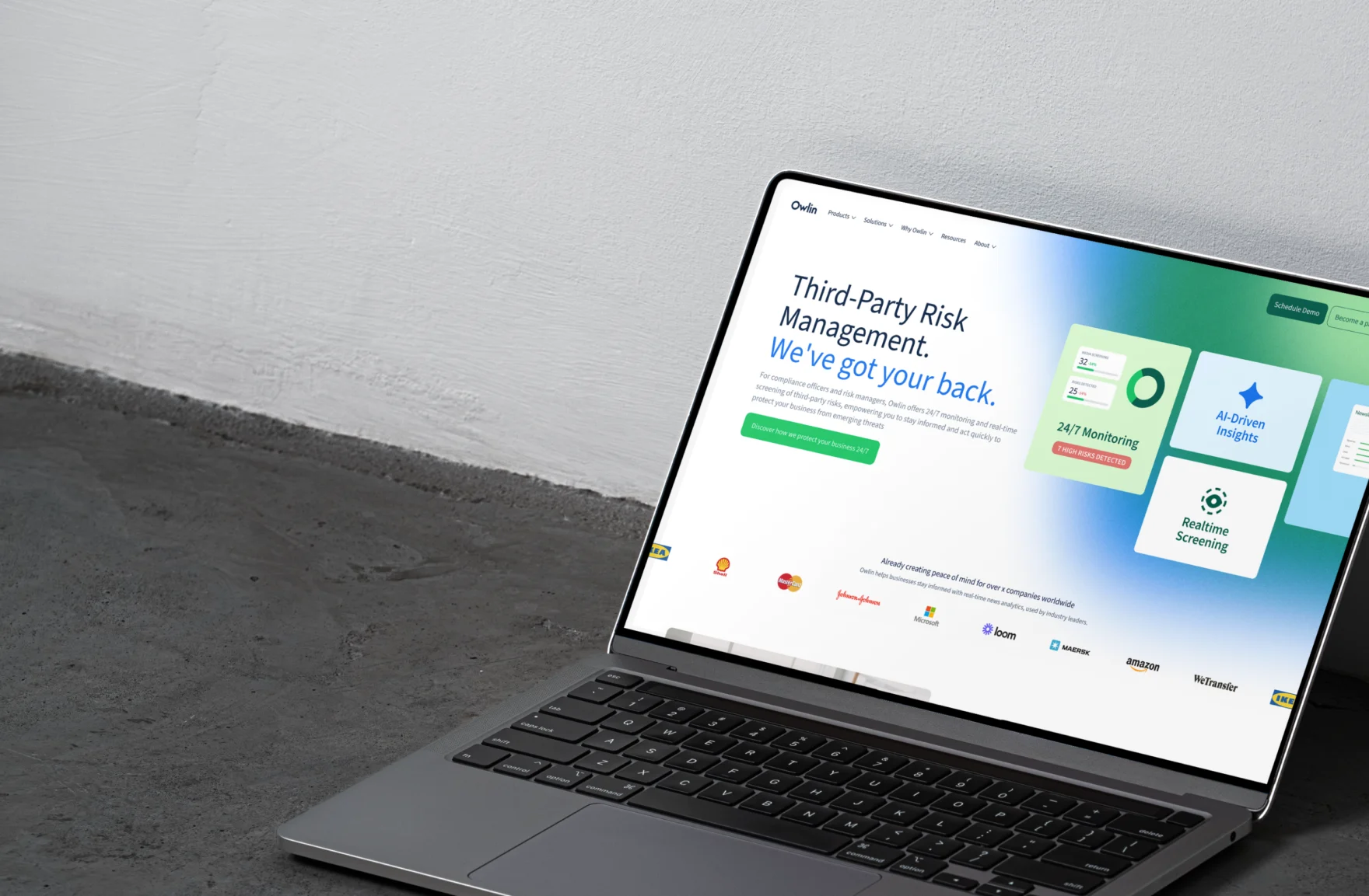
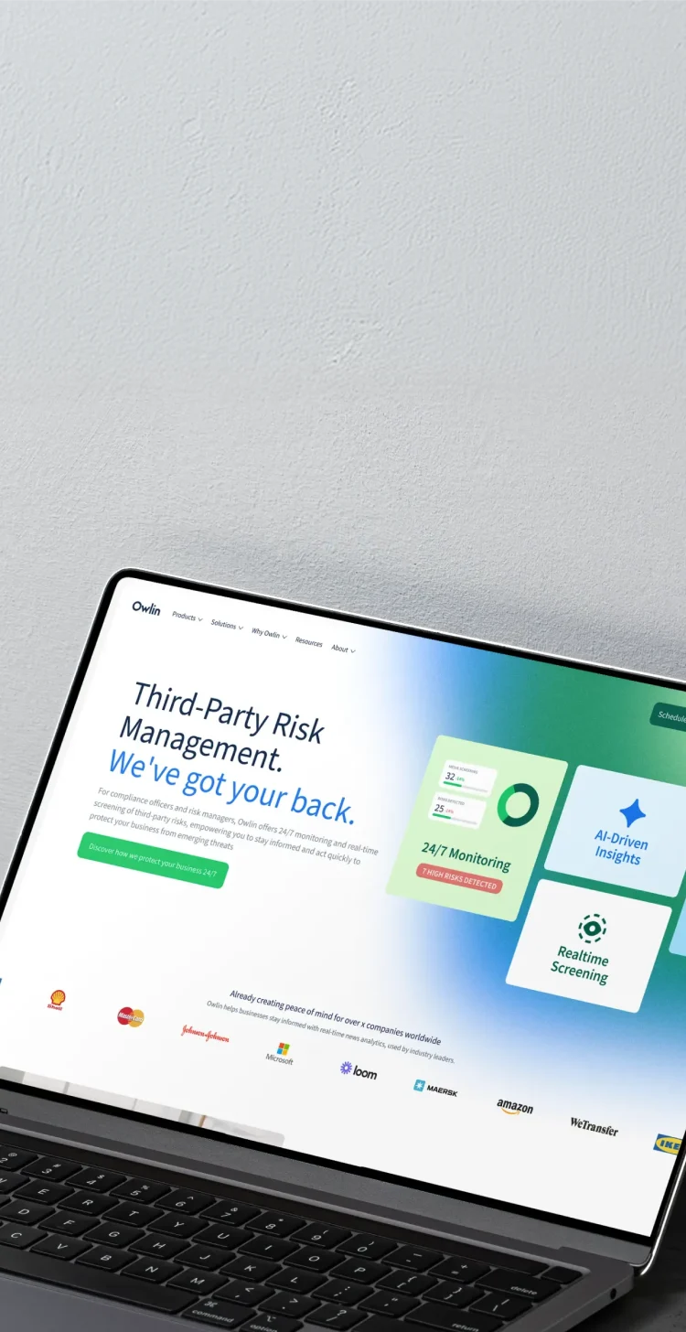
Owlin monitors risk for leading financial institutions. Its website did not yet reflect the maturity of the product or the company behind it.
Context
Owlin is an Amsterdam-based risk intelligence company. Its platform screens and continuously monitors third parties for adverse media, sanctions and other external risk signals. Banks, payment providers and large enterprises rely on it, including Adyen, KPMG, Schroders, Verizon and Worldline.
The market around Owlin has changed quickly. Regulations such as DORA, the CSDDD and the German Supply Chain Act have made third-party monitoring more continuous and more important at board level. Owlin came to Mars in a clear growth phase, with product-market fit established and an international client base. The website had not developed at the same pace.
The strategic tension
Owlin operates alongside modern SaaS companies and is often compared with them. The technology, client base and proof were already there. What was missing was a digital presence that reflected the same level of maturity.
That gap mainly showed up in perception. The platform is built around machine learning and continuous data analysis, while the website made the company feel more traditional. The difference was not between what Owlin promised and what clients experienced, but between the quality of the product and how it came across online.

The real challenge
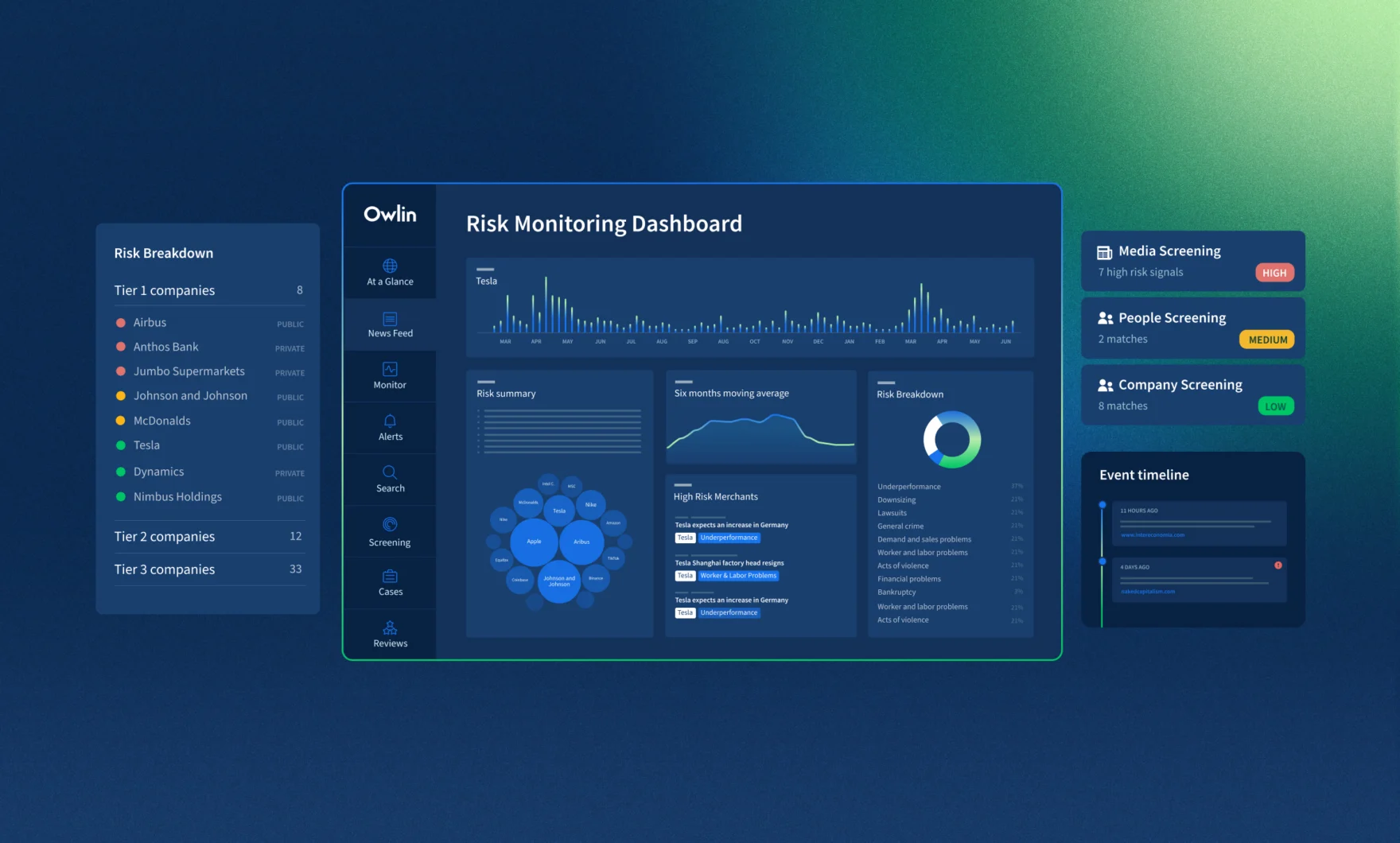
In a conversation, the Owlin team could explain the platform clearly. How screening surfaces relevant signals, how monitoring detects change and where automation helps analysts work more efficiently. Online, much of that remained difficult to see. The product was mainly shown through compressed screenshots, which made it feel more like an alerting system than an intelligence platform.
The website structure also followed the organisation more than the visitor. Owlin serves many different situations, from merchant risk at a payment provider to vendor risk at a bank, but those routes were difficult to find. A risk manager often had to work out for themselves which part of the platform was relevant to their situation.

Our approach
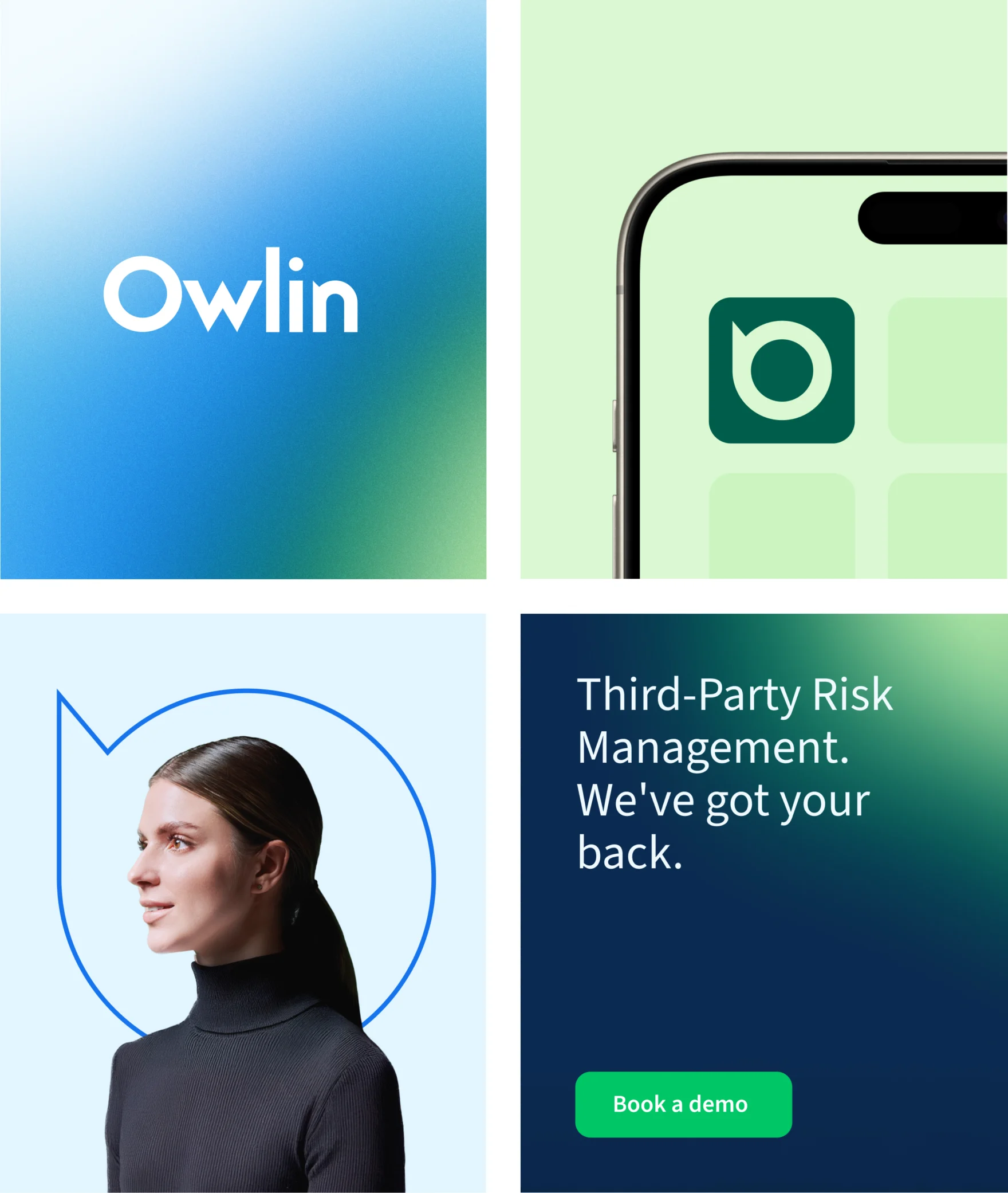
We started with the existing brand rather than replacing it. Owlin had already built recognition in its market, so the focus was on strengthening the elements that still carried value. The logo stayed, as did the blue and green colour palette, which we refreshed and extended with a subtle gradient to better express the innovative character of the platform. The way these elements were used changed.
Dark blue previously dominated much of the website. It now creates structure without defining every screen. More white space gives the content room, while green is used more deliberately to guide attention and action. Long passages were broken into clearer modules, feature highlights and visual explanations. Stock photography was removed, so every image now has a specific role.
Strategic choices
We reorganised the website around the situations visitors arrive with. Navigation now runs by use case, industry and regulation, helping risk professionals recognise their own context more quickly. That makes it easier to understand where Owlin fits before having to explore the wider platform.
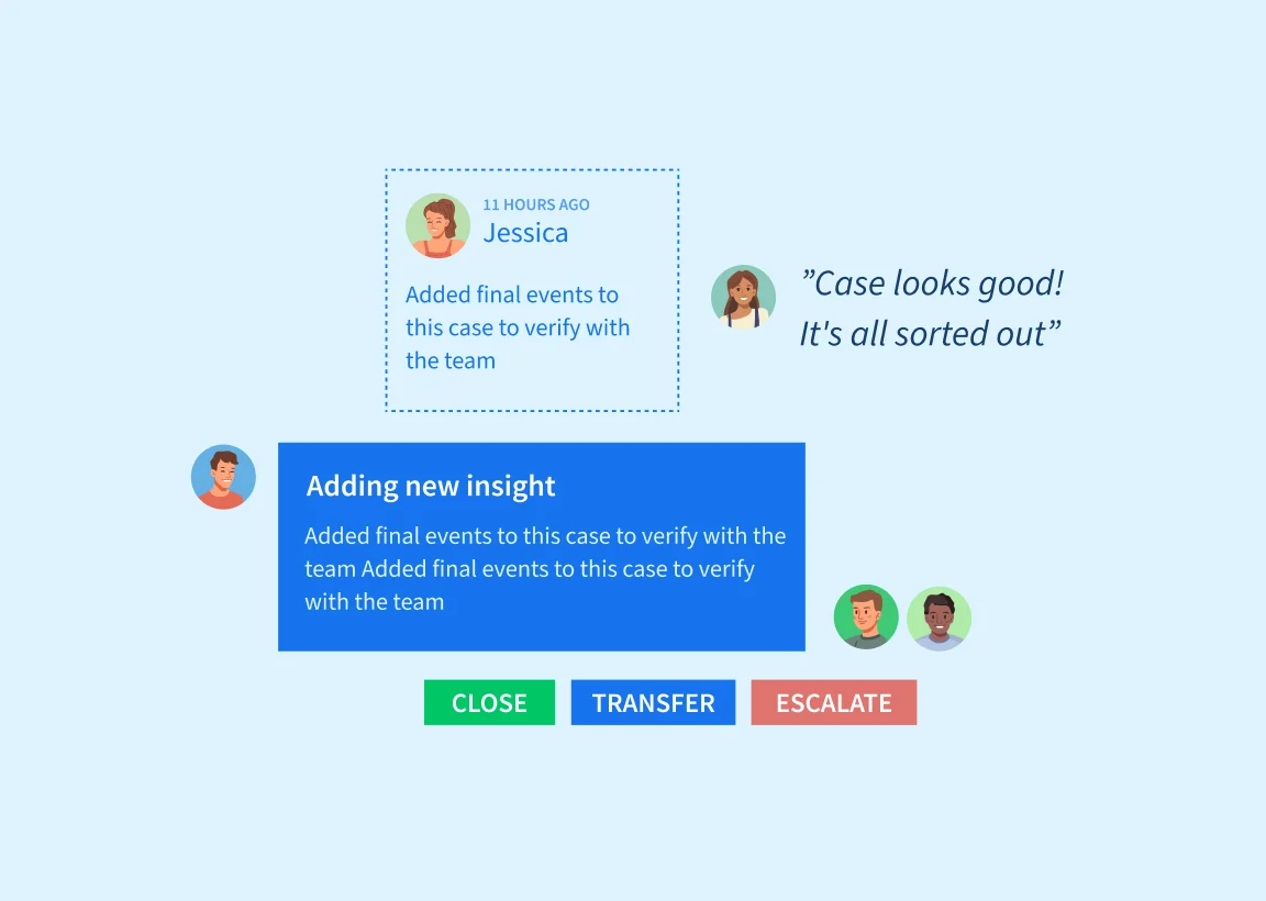
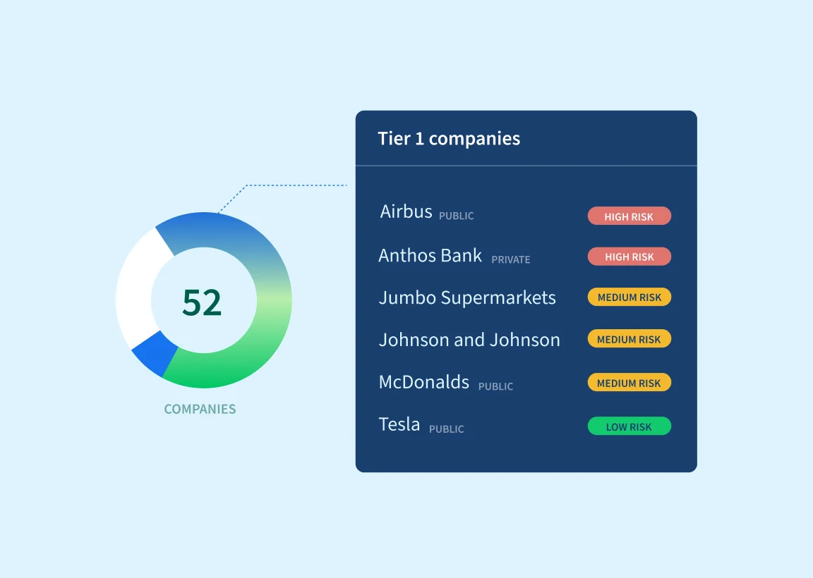
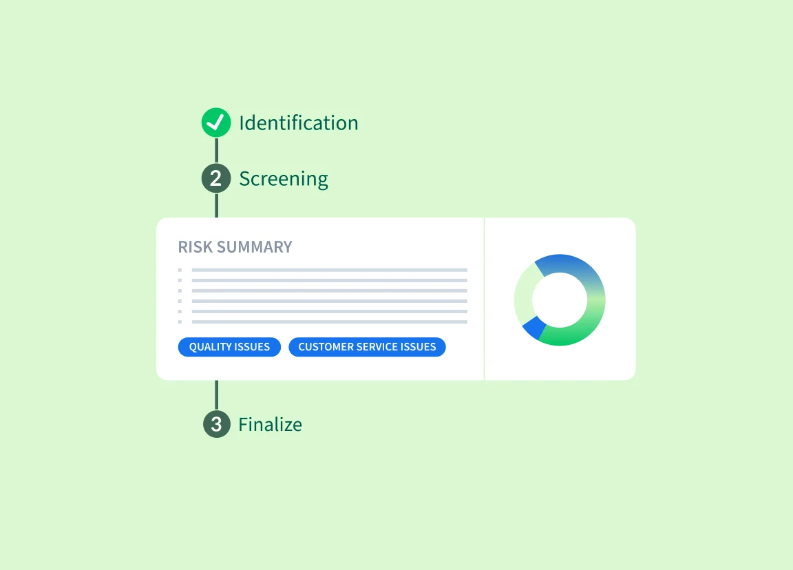
We also made the product itself easier to understand. Custom illustrations explain what screening does, how monitoring works and what the output looks like. Owlin is one part of a broader risk infrastructure, so the different delivery options are now shown clearly: dashboard, API integration and daily newsletter. This helps organisations see how the platform fits into the systems and workflows they already use.

The result
The clearest change is the alignment between the company and its digital presence. Internally, the brand better reflects the maturity and ambition of Owlin. Externally, prospects and partners can understand faster what the platform does, who it is for and how it fits into their organisation.
Marketing and sales also have dedicated pages for specific industries, use cases and regulations. Instead of sending every prospect to the same general story, they can direct people to the part of the website that matches their situation.

Reflection
Growing technology companies often assume that a website which feels behind requires a complete rebrand. That is not always the right answer. Recognition, customers, technology and proof may already be there. The opportunity is often to identify what is worth keeping and build a digital experience that reflects the level at which the company wants to compete.
The second part is structure. A market is rarely one audience. It is usually a collection of different situations, each with its own priorities, language and regulations. A strong website helps people recognise their own situation without asking them to translate the company first.