Colors in Biotech: what makes them powerful and effective?
We’re often asked about the role of color in branding, especially in specialized fields like biotech. Colors have a huge impact on how a brand is perceived. They can evoke emotions, build trust, and reinforce a brand’s core values—before a single word is even read.
As a biotech design agency, we’ve seen how the right colors can make all the difference. In this article, we’ll dive into why color matters in biotech branding and how you can use it to your advantage.
Why are blue, green, and white the go-to colors in Biotech?
KColors have a strong psychological impact. The right shade of blue, for example, instantly conveys trust—a reason it’s widely used in the financial sector. But why blue? It dominates our atmosphere and oceans, evoking feelings of calm, consistency, and stability. Since these natural elements are ever-present and reliable, our brains associate blue with predictability and trustworthiness. Psychology and cultural context also shape color perception.
Striking the right balance is key. Biotech brands should use color strategically—being professional doesn’t mean being dull! A fresh, unique palette signals innovation without compromising credibility.
Inspiring color palettes: how Biotech brands communicate trust and innovation
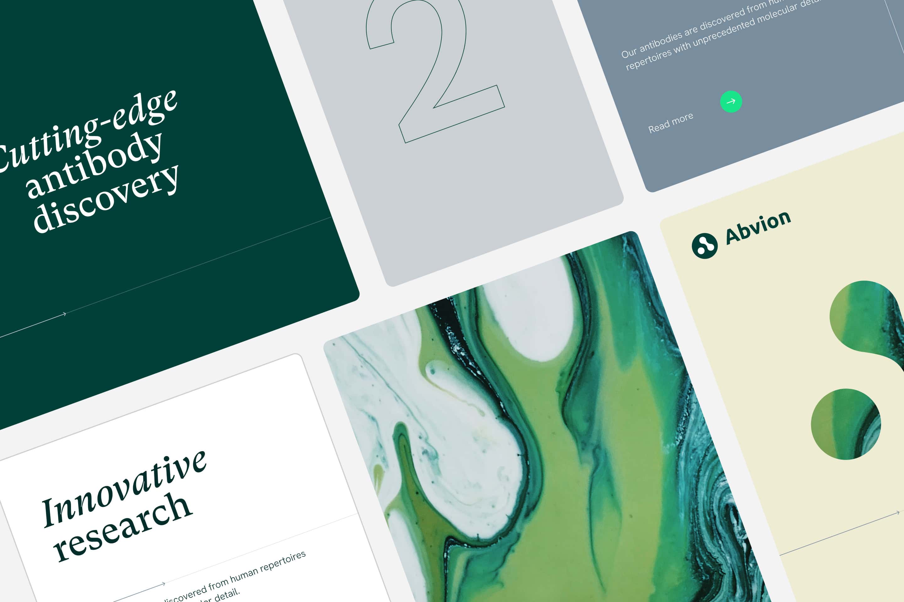
For our client Abvion, everything revolves around harnessing the natural power of the immune system, which is reflected in the color palette we selected. The deep green symbolizes connection to biology, health, and growth, while the organic textures give it an authentic and natural feel. Fresh green accents add a modern and energetic touch. This blend of calm and dynamism perfectly communicates their balance between innovation and reliability—exactly what you’d expect from a leading biotech brand.
For Scenic Biotech, we combined navy blue and light blue to highlight trust, professionalism, and innovation, while soft pink adds warmth and humanity. The colors amplify their message of scientific breakthroughs offering hope to patients. The flowing shapes in these tones radiate dynamism and creativity, fitting with their mission.
Digital perfection: ensuring colors work everywhere
Colors can sometimes appear differently on screens than on paper. That’s why it’s essential to use colors that render well across different devices and screens. For example, a bright lime green might be too intense on a laptop, but perfect on a phone.
Our team always tests how colors perform in various contexts: desktop, mobile, paper, and even in dark and light themes. We also ensure enough contrast between colors to keep everything accessible and readable. This way, the brand looks sharp and user-friendly.
Common mistakes in color choices and how to avoid them
One pitfall is playing it too safe. Many biotech brands stick to standard ‘safe choices’ and don’t venture beyond. This can be limiting since you want to stand out in a competitive market. Our advice? Dare to experiment and let us explore bold options.
Another mistake is not considering consistency enough. A color might look great in your logo, but if it’s not easy to apply across your website, packaging, or promotional materials, you create an inconsistent brand image. And that’s something we want to avoid.
Colors are more than just paint on your brand’s wall
Colors are a powerful tool to tell a biotech brand’s story. They communicate who you are and what you stand for, even before anyone reads a word. The key is to choose colors that not only look great but strategically contribute to the brand message.
As a branding agency, we help brands use color to create the right impact. Do you have a biotech brand (or any other brand) that could use a creative color boost? Let’s explore how the right colors can strengthen your identity.
We’d love to brainstorm with you!