Greensteps | Trust is built before the website. The website needs to confirm it.
Greensteps operates in a market built on relationships and expertise. Its brand did not yet reflect the level at which the company was doing business.

Client
Greensteps
Industry
Energy & Sustainability
Environmental commodities
Services
Brand strategy
Visual identity
Illustrations and infographics
Online marketing materials
Offline marketing materials
Website strategy
Wireframes and sitemap
Web design
WordPress development
Context
Greensteps is a specialized trading company in environmental commodities. It connects buyers and sellers across green gases, carbon offsets and Energy Attribute Certificates, working with energy suppliers, industrial companies, airlines, fuel suppliers and other traders. Deep market knowledge and a relatively small team allow Greensteps to operate flexibly in a complex and fast-moving market.
The company was growing its team and deal pipeline, with the ambition to become a leading trader of green gases in Europe and beyond. But its brand had barely developed since the company started. There was no real brand identity, while the website consisted largely of a one-page story that no longer accurately reflected the business.
The strategic tension
Greensteps does not operate in a market where most clients arrive through Google. Relationships are built through conferences, introductions and direct sales conversations. The website often comes later, when someone wants to verify the company they have just met.
That made the gap particularly relevant. Greensteps could explain its expertise convincingly in person, but the brand did not support that story afterwards. The company operated between major energy and industrial players, while its digital presence made it feel smaller and less established than the business behind it.

The real challenge
The problem went beyond an outdated design. Parts of the website described services Greensteps no longer offered, while newer activities such as environmental certificates were missing. The opening imagery showed a rainforest, creating an impression closer to an environmental organisation than a commercial trading company.
The website also did little to explain Greensteps’ role in the market. Its knowledge, flexibility and ability to move quickly between buyers and sellers were difficult to see. After a strong conversation at an event, visiting the website could therefore create a trust gap instead of confirming what someone had just experienced.
Our approach
We started with positioning, not visual identity. Through workshops, we clarified Greensteps’ audiences, proposition, services and role in the market. The commercial and environmental sides of the company needed to coexist. Greensteps sees the transition to net zero as both a climate challenge and a commercial opportunity, with finance playing an important role in accelerating that transition.
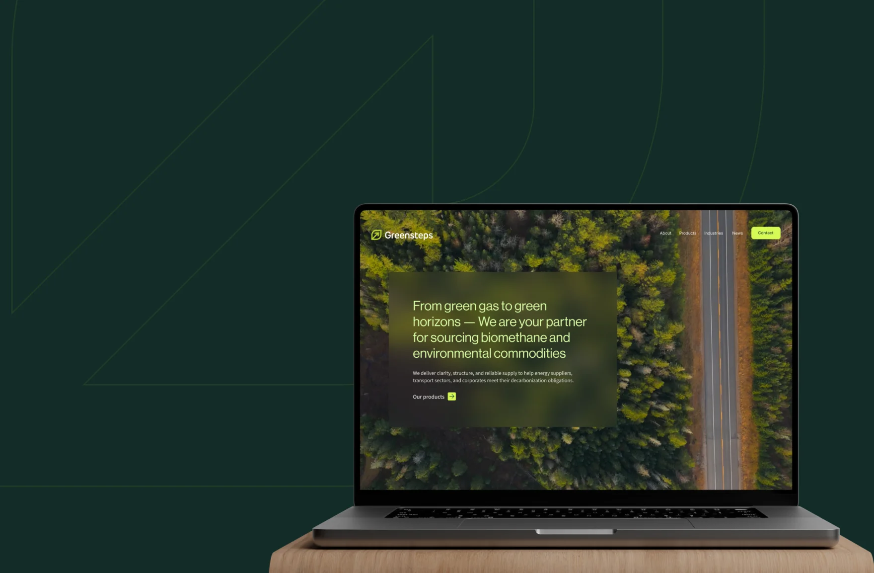
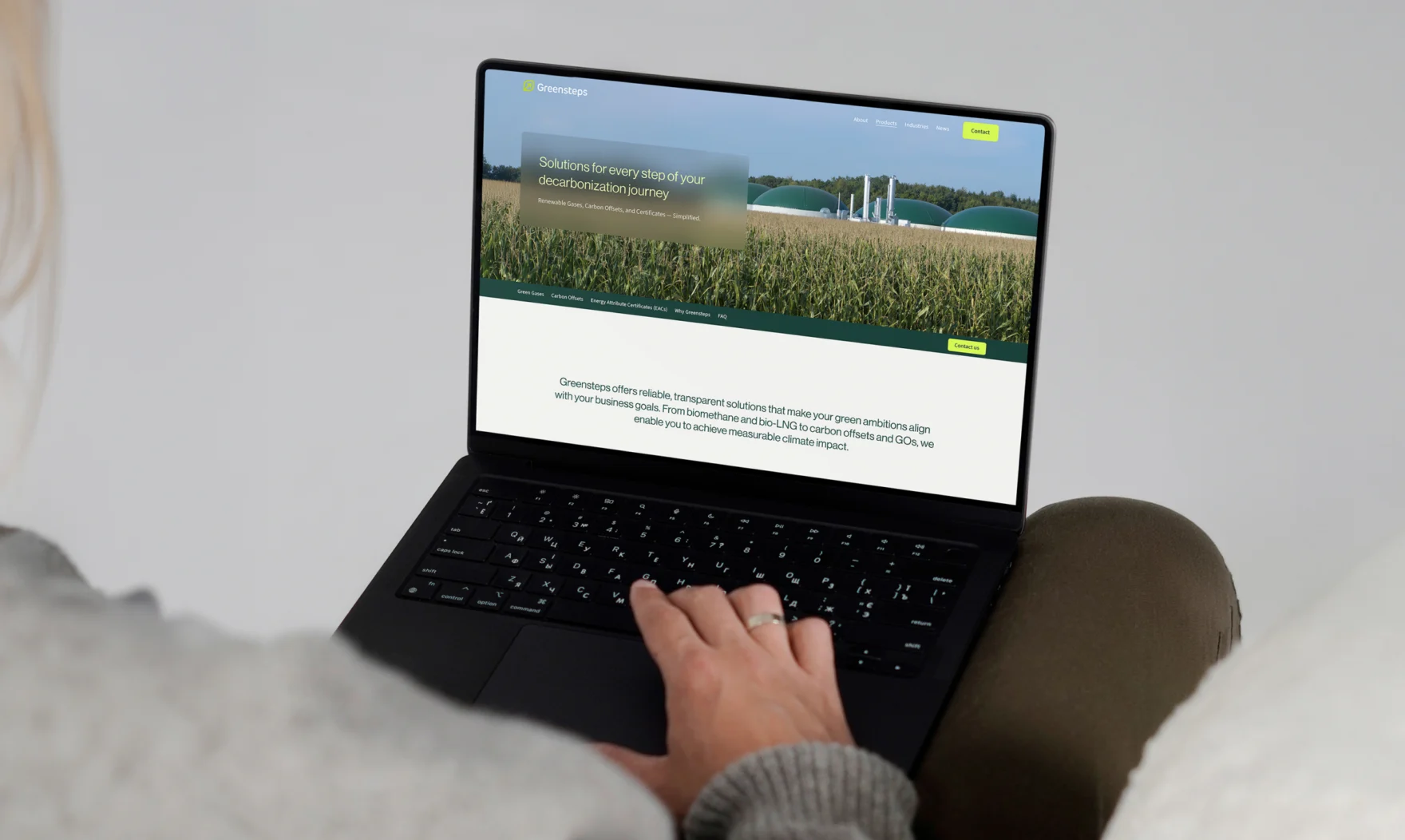
From there, we built the brand and website around a much simpler story. The three core product categories became immediately visible, while the wider proposition was reduced to what visitors actually needed to understand. Wireframes established that hierarchy before it was translated into a new logo, visual identity, website and supporting brand materials.

Strategic choices
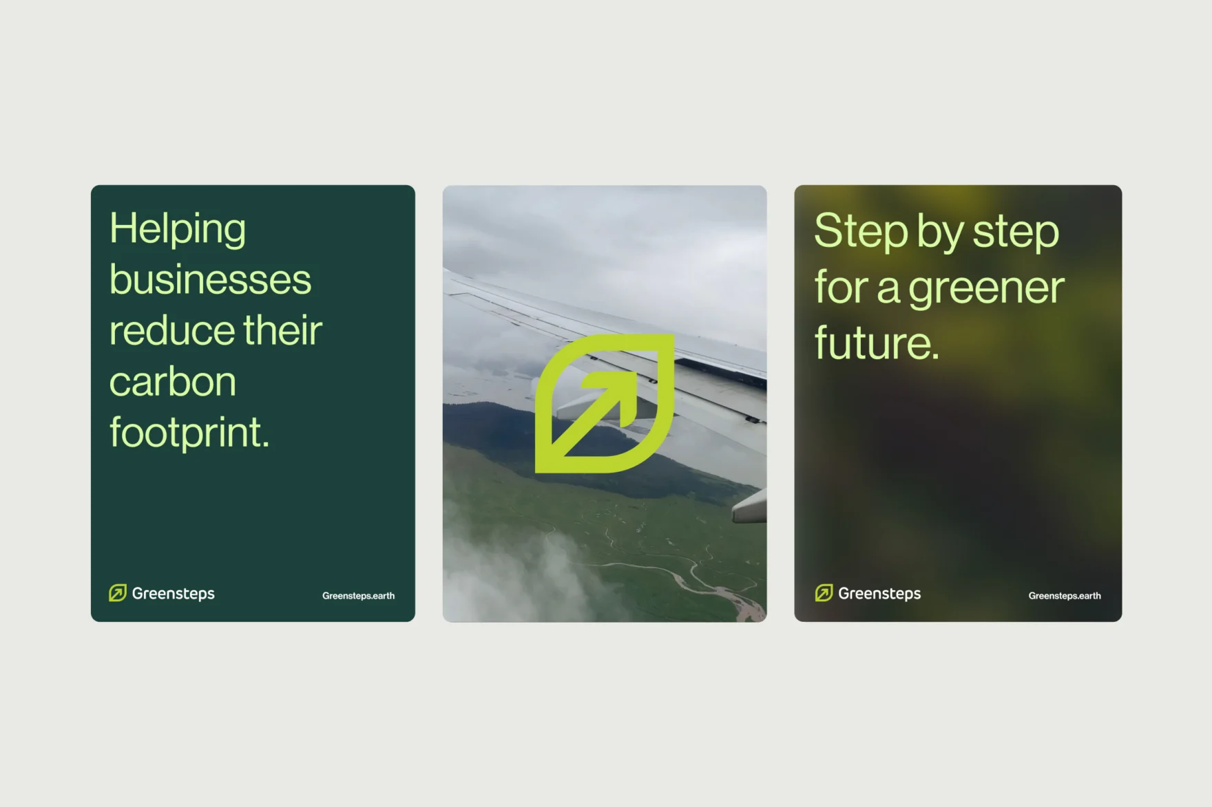
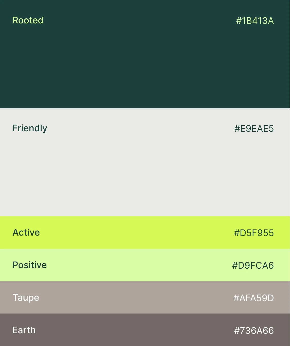
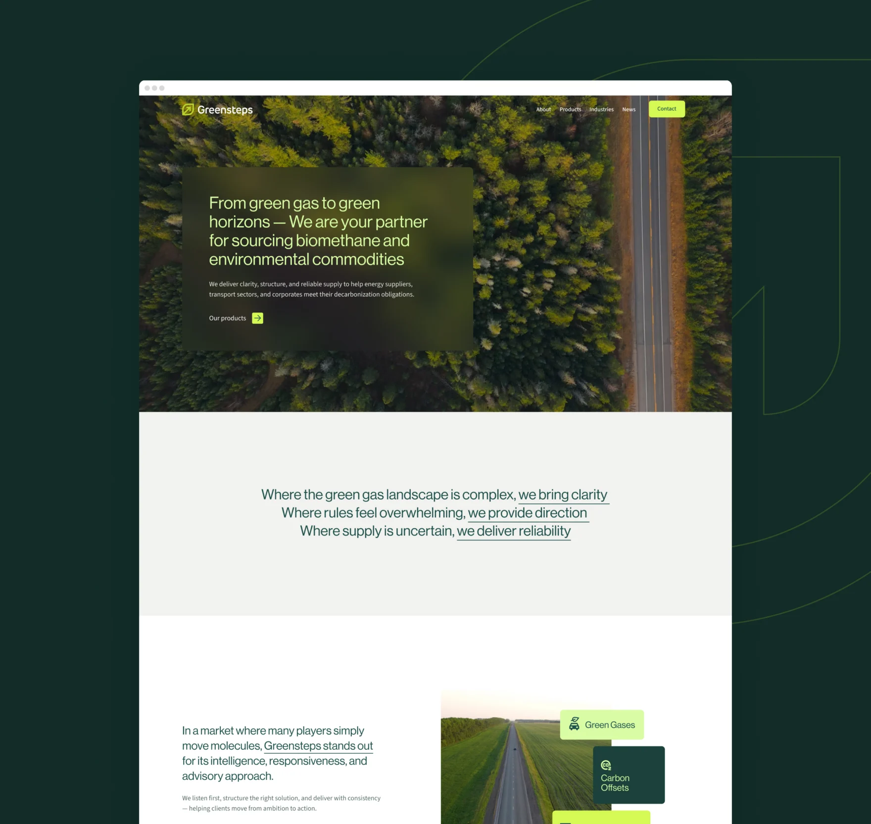
The identity needed to feel connected to the energy transition without becoming another generic green brand. The new symbol combines a leaf with forward movement, reflecting both environmental progress and commercial momentum. A broader palette of greens, earth tones and brighter accents gives Greensteps a more distinctive visual language, while transparent layers add a sense of movement and openness.
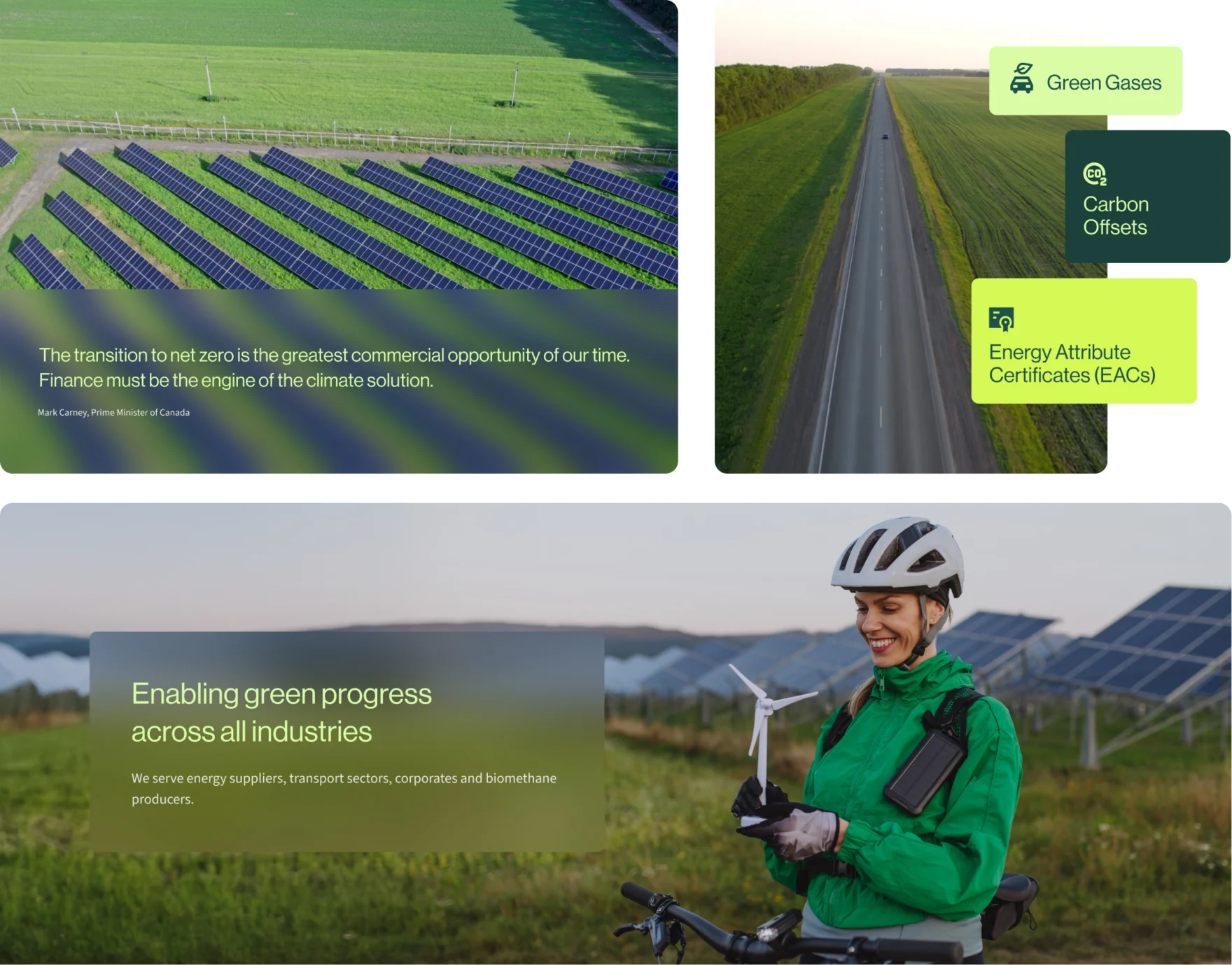
The website follows the same principle of clarity. Green Gases, Carbon Offsets and Energy Attribute Certificates each have a recognizable place and visual character. Long explanations and unnecessary content were removed. Instead, visitors can quickly understand what Greensteps trades, which markets it serves and why its smaller, specialized team can be valuable alongside much larger players.
The result
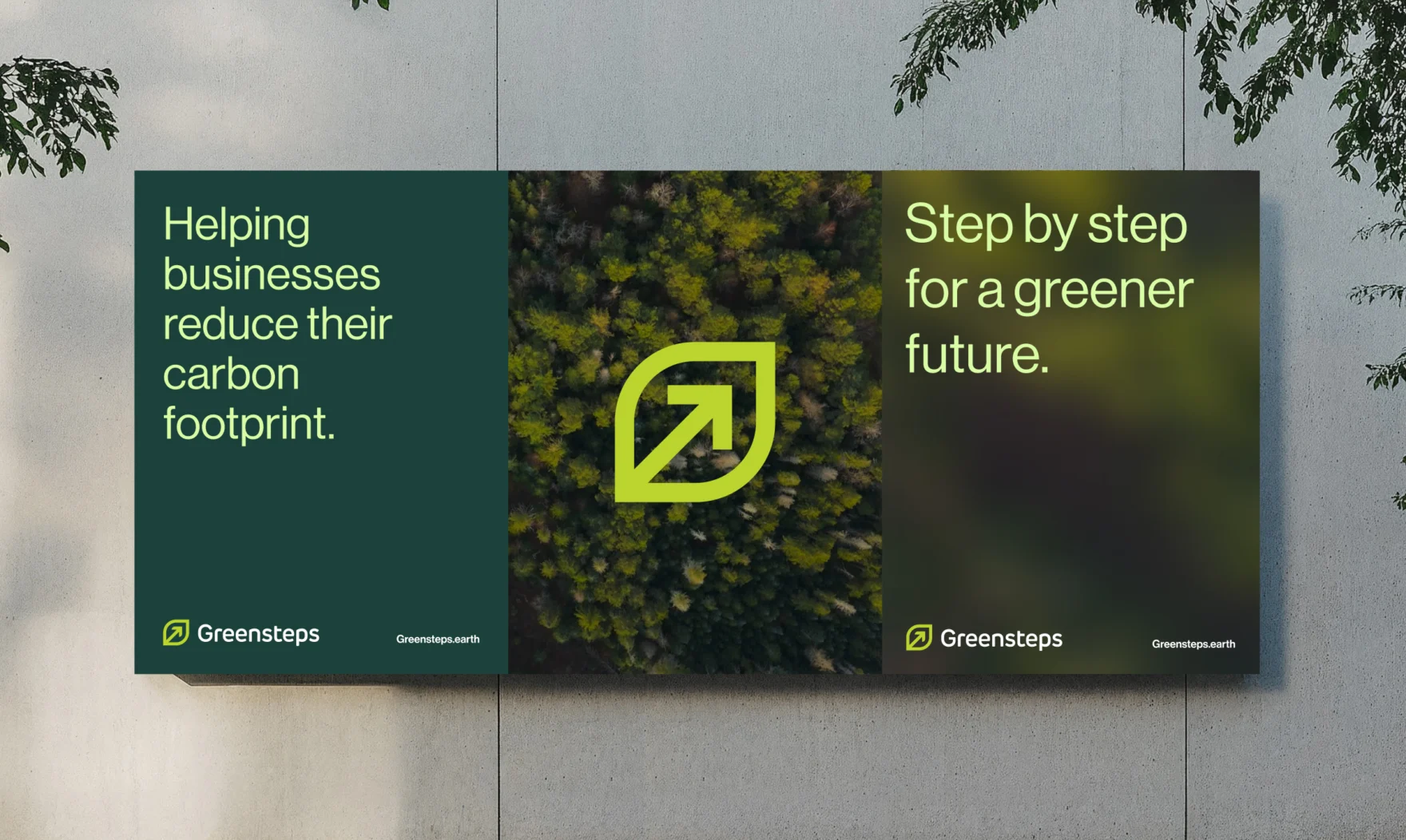
The new identity has already been used across Greensteps’ physical and digital presence. Mars developed the visual materials for an industry event where the new brand was presented as one consistent system. Greensteps reported positive reactions and was particularly pleased with how professional and recognizable the company appeared alongside other exhibitors.
The change also supports the sales process beyond events. The team can now explain its services with a brand and website that reinforce the same story afterwards. There are no reliable website conversion figures to report, and that is not currently how Greensteps measures its success. The website’s primary role is to strengthen confidence once a commercial conversation has already started.
Reflection
Not every B2B website needs to generate the lead. In specialized markets, the most important commercial moment may happen at a conference table, through an introduction or during a direct conversation. But that does not make the website less important. It changes the job it needs to do.
When a prospect checks the company afterwards, the experience should confirm the expertise they just encountered. If the brand feels smaller, less professional or tells a different story, trust can disappear at exactly the wrong moment. For Greensteps, the website is not the beginning of the sales journey. It makes sure the digital impression lives up to the personal one.