What animation really adds to your website
“Could we add an animation here?” “Something with movement, just to make it feel a bit more lively.”
It’s a question we’re hearing more and more often. And while movement can certainly add value, animation is much more than just a visual extra. It strengthens your brand, supports the content, and helps visitors navigate your site more intuitively. At Mars, we don’t see animation as decoration, but as a smart design tool built with attention to technique, performance, and user experience. In this blog, you’ll discover how we design animations that don’t demand attention, but truly enhance the experience.
So, what exactly is an animation?
On a website, an animation is a visual transition or movement. Think of buttons that respond when you hover over them, images that slide into view as you scroll, or a smooth effect when opening a menu. They’re often built with CSS or JavaScript, or with libraries like GSAP. Some animations are subtle, others deliberately grab your attention. But in every case, the goal should be the same: making it easier and more intuitive for users to move through a website.
Why we use animation functionally
A well-chosen animation enhances the design. It can create structure, highlight key elements, or guide the user’s attention. Animations support the content and contribute to the overall experience. They help users quickly understand where they are, what’s happening, and where they can go next.
That’s why we never add animations just for the sake of it we use them purposefully, in places where they truly add value.
The technical side of things
Animations might seem simple, but there’s a lot of technical work involved. Each one is unique, tailored to the design and its function. That also means: plenty of testing across devices, screen sizes, and browsers. What looks smooth on a laptop should also work seamlessly on a phone. And performance matters too. Animations should never slow down your site or harm the user experience. That’s why we build them to be lightweight and efficient, without unnecessary load.
When it doesn’t work
Too much animation can work against you. If it distracts, causes delays, or creates confusion, it damages the experience. Some users, like those with motion sensitivity, can even be negatively affected by animations that are too intense or start unexpectedly.
That’s why we always ask the same questions: Is this really necessary? Does it support the user experience? Could it be simpler or more subtle? That’s how we ensure that animation helps — rather than hinders.
What that looks like in practice
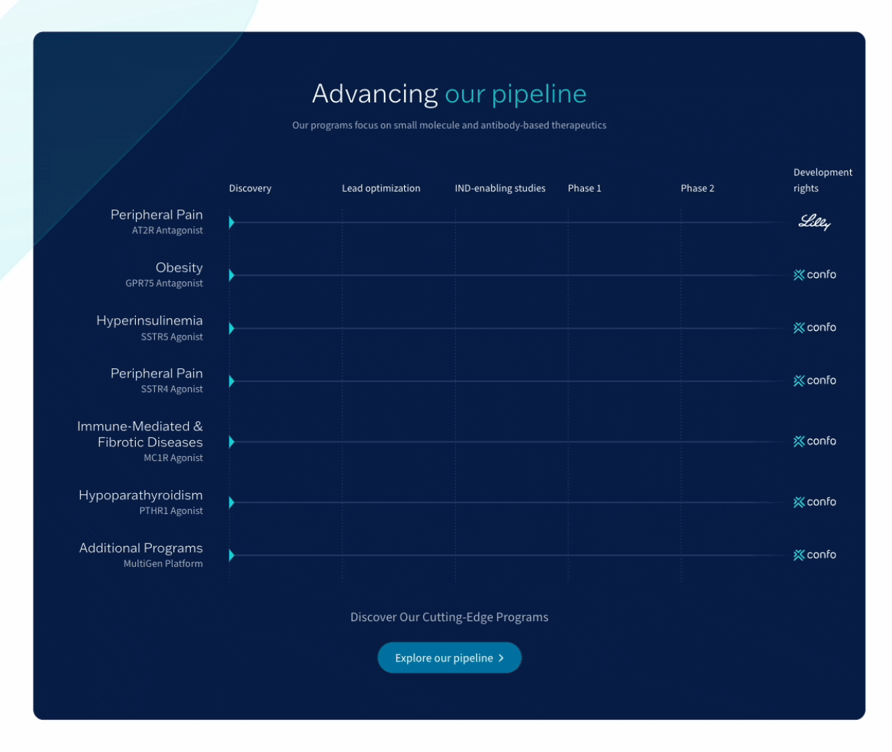
A great example of how we use animation functionally is the pipeline on the website of Confo Therapeutics. We designed an interactive animation that gives users a clear overview of the progress of their research projects at a glance. It’s not only fully aligned with their brand identity, but also clear, well-structured, and intuitive to use. The animation adds structure, visualises each phase, and guides the visitor naturally through the information exactly what a good animation should do.
We also apply animation smartly in other projects:
At Prefabriek: the animation shows how an extension is built step by step.
For Billy Grace: it visualizes how the platform works.
With Adamas Intelligence: the animation clearly highlights the industries they operate in.
Curious what animation could do for your website? Or want to brainstorm smart applications together? Feel free to get in touch we’d be happy to think along with you.